The Problem
Most expense tracking apps try to do too much — packing every screen with data and options.
The result? Users get overwhelmed, stop logging expenses, and abandon the app altogether.
I wanted to design something minimal, beautiful, and effortless — where tracking your money feels as natural as checking the weather.
The Goal
Create a simple, intuitive expense tracker that users actually want to open every day.
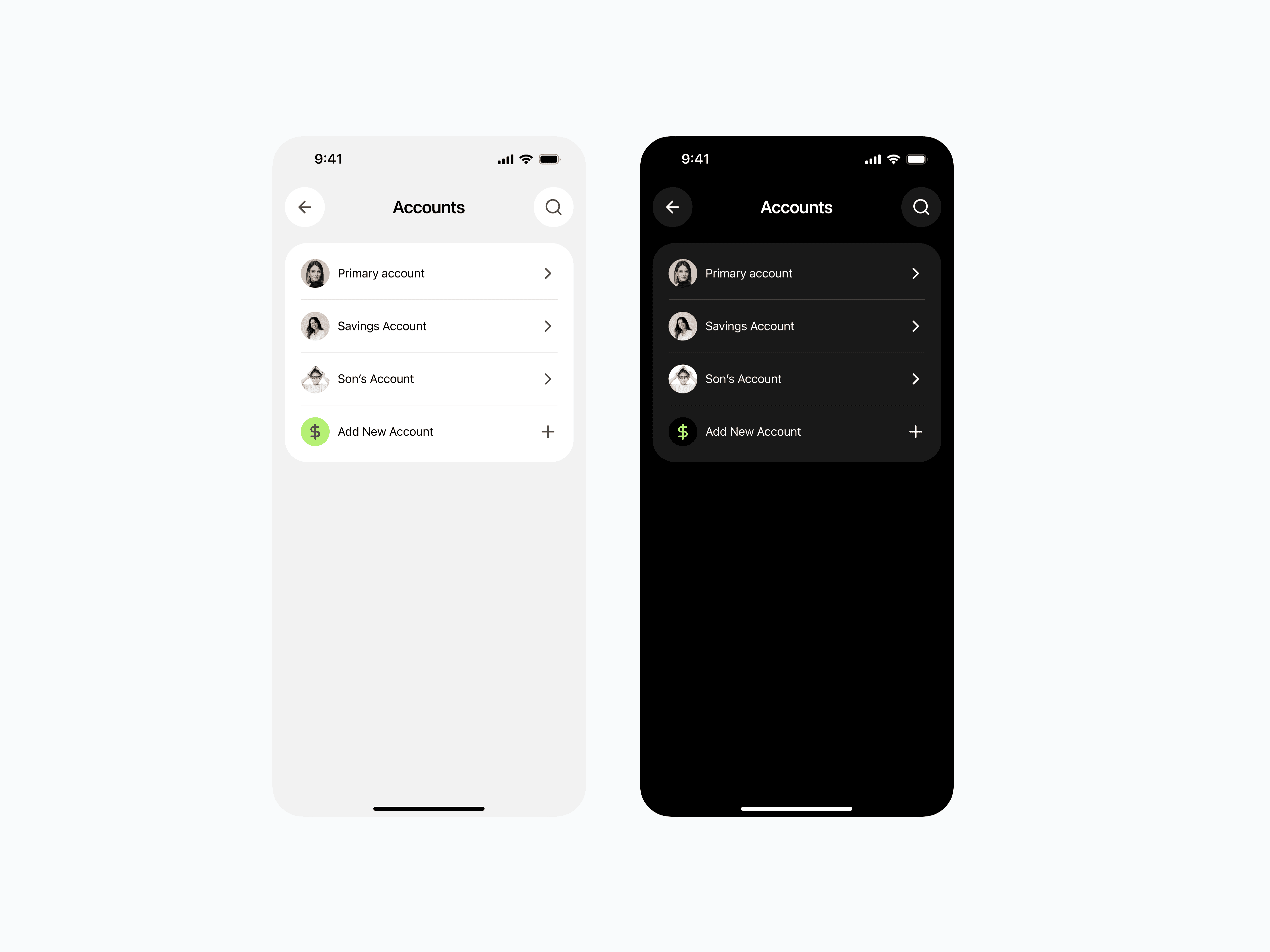
Keep all core features (categories, payees, multiple accounts, refunds) without making the interface feel crowded.
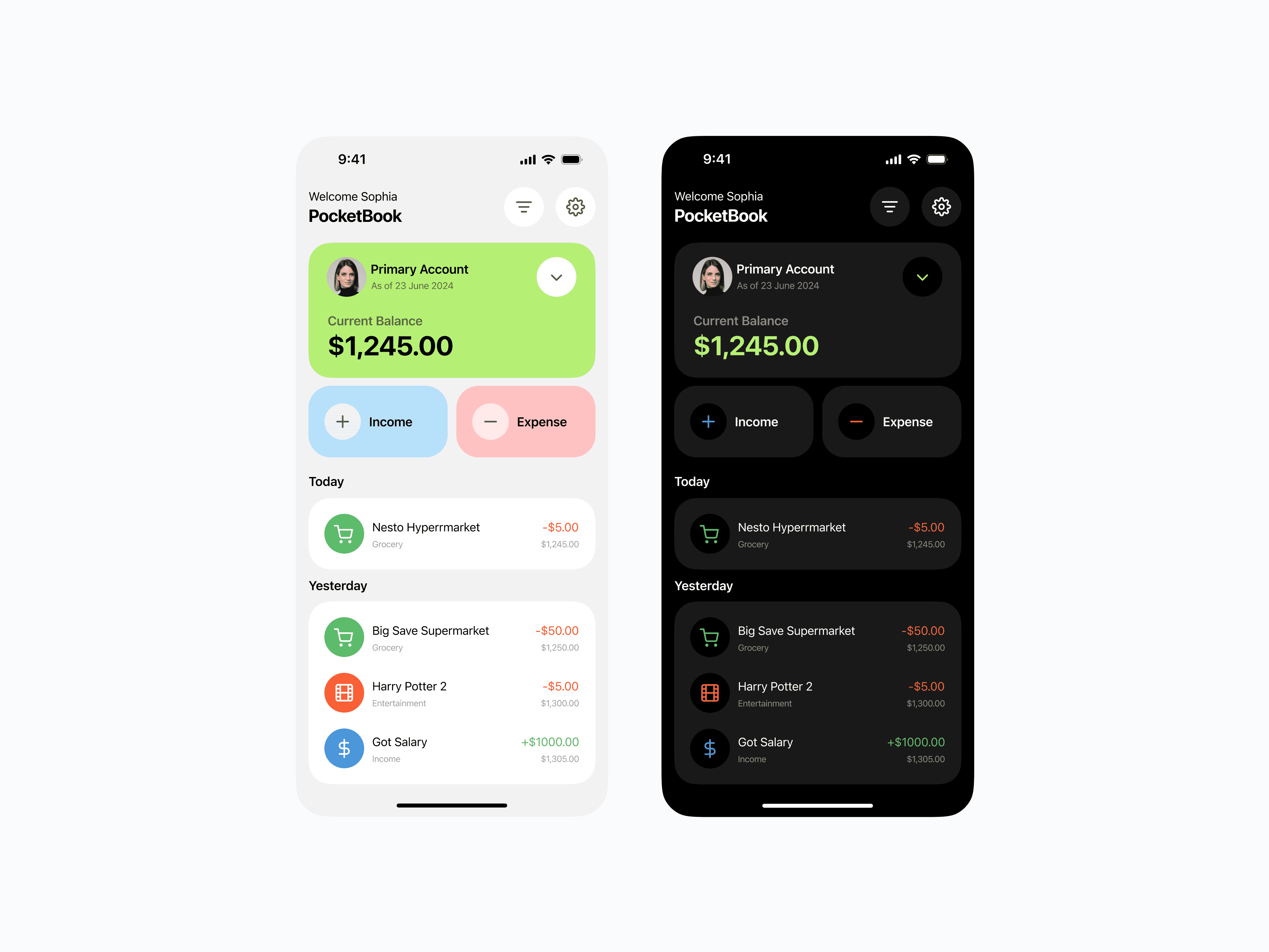
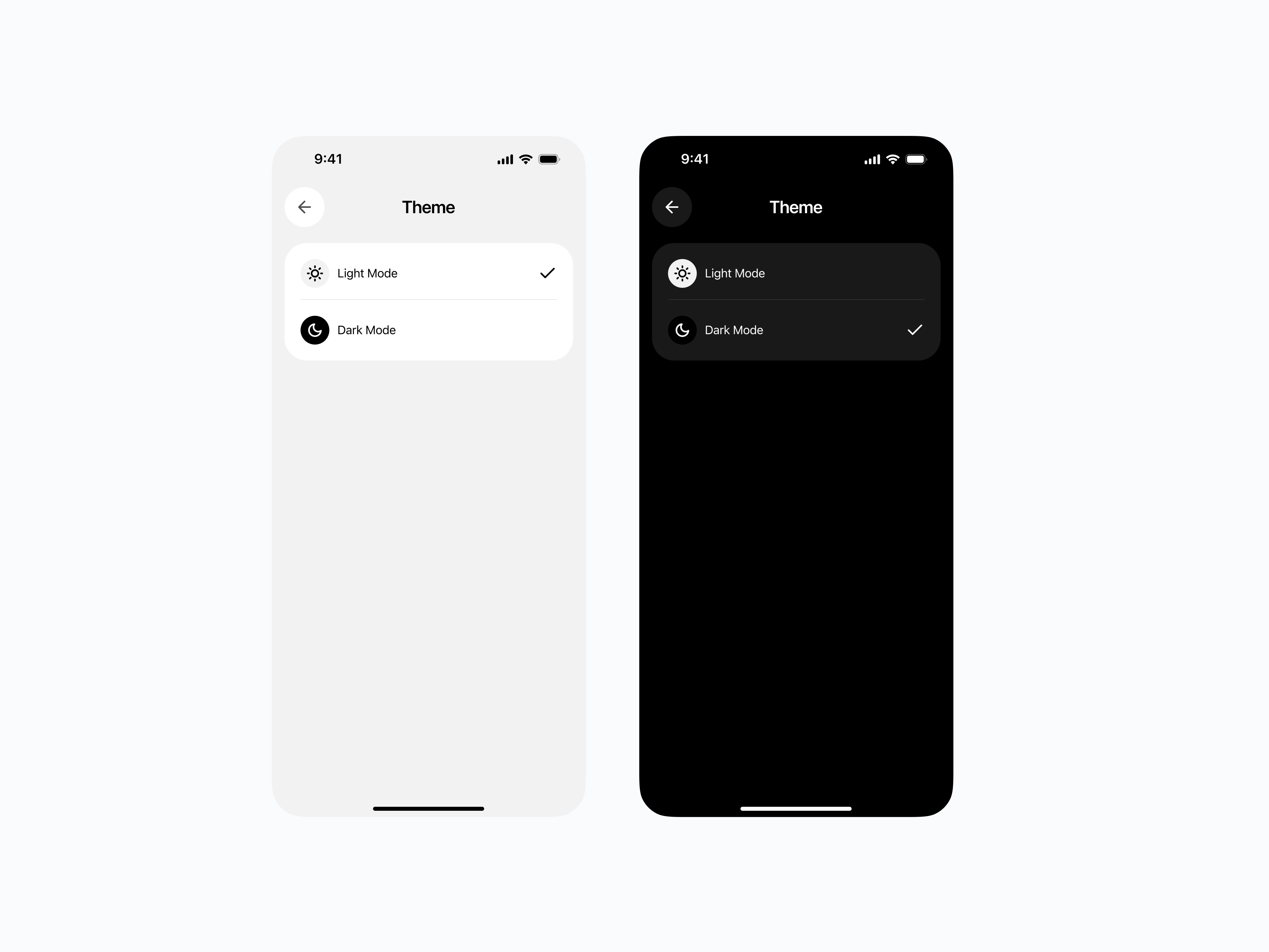
Offer both light and dark modes for comfort and personalization.
The Design Approach
Clarity at a Glance
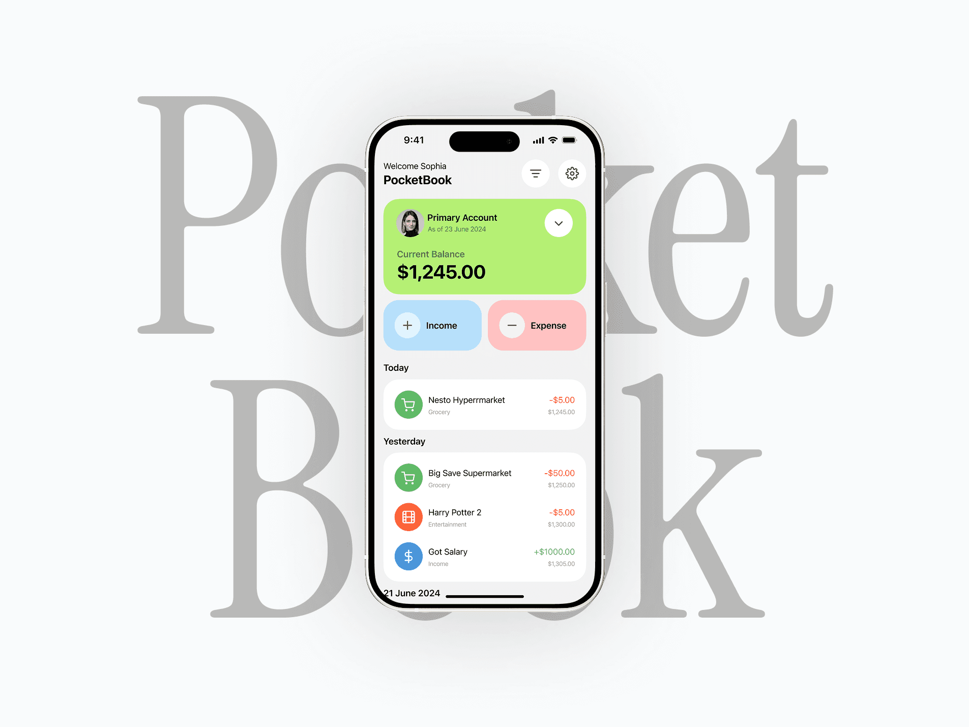
Balance first: The most important info (current balance) is highlighted in a bright, attention-grabbing card.
Two big buttons: “Income” and “Expense” are color-coded for quick recognition — blue for adding, red for subtracting.
Transactions list: Sorted by date, each with clear category icons, merchant name, and amount in green or red.
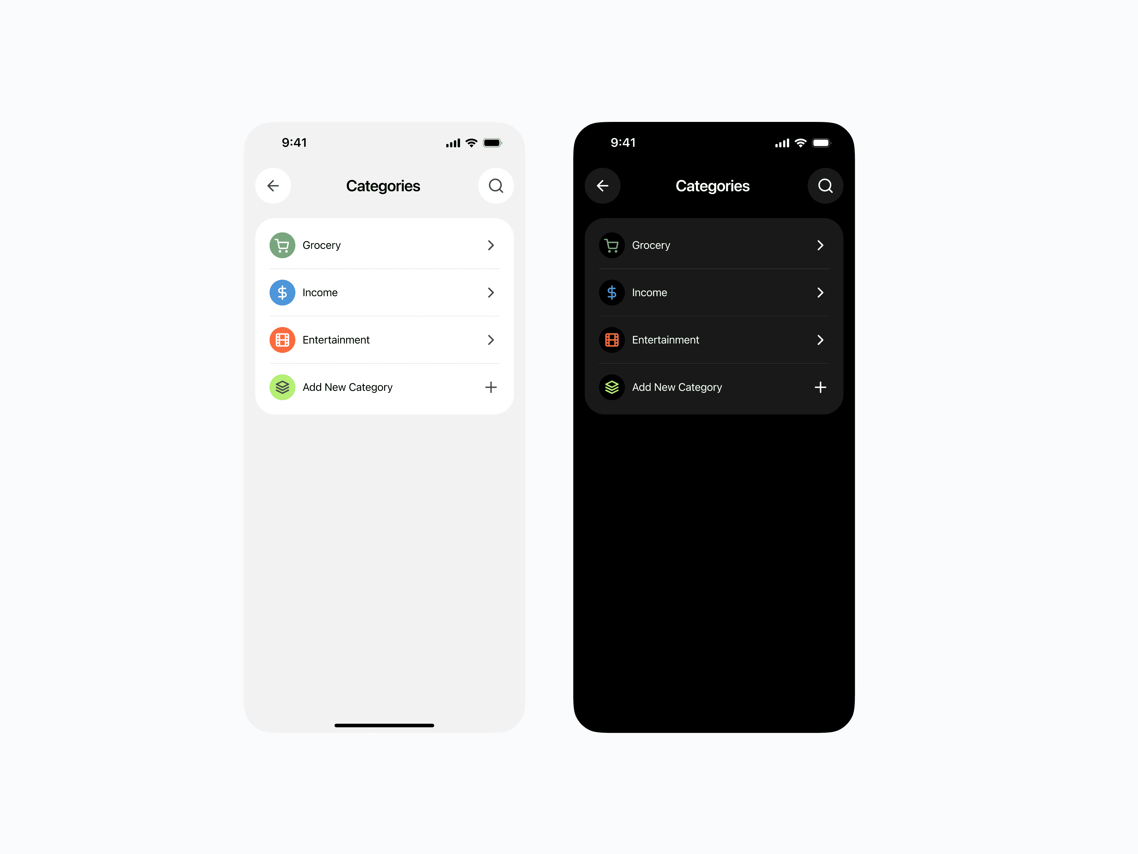
Color as a Functional Element
Positive amounts = green
Negative amounts = red
Neutral UI elements = soft gray or black
The color palette doubles as a guide — users can instantly scan and understand their spending patterns.
Light & Dark Mode
Why both? Comfort and user preference. Some users prefer bright visuals, others prefer low-light reading.
Designed both versions to retain clarity — ensuring colors and contrast stay strong in either mode.
Minimal but Complete Features
Multiple accounts: Switch between them without clutter.
Categories: Simple icons help identify spending at a glance.
Payees: Track who you’re paying, not just what you’re paying for.
Refunds: Easily log and separate them from income.
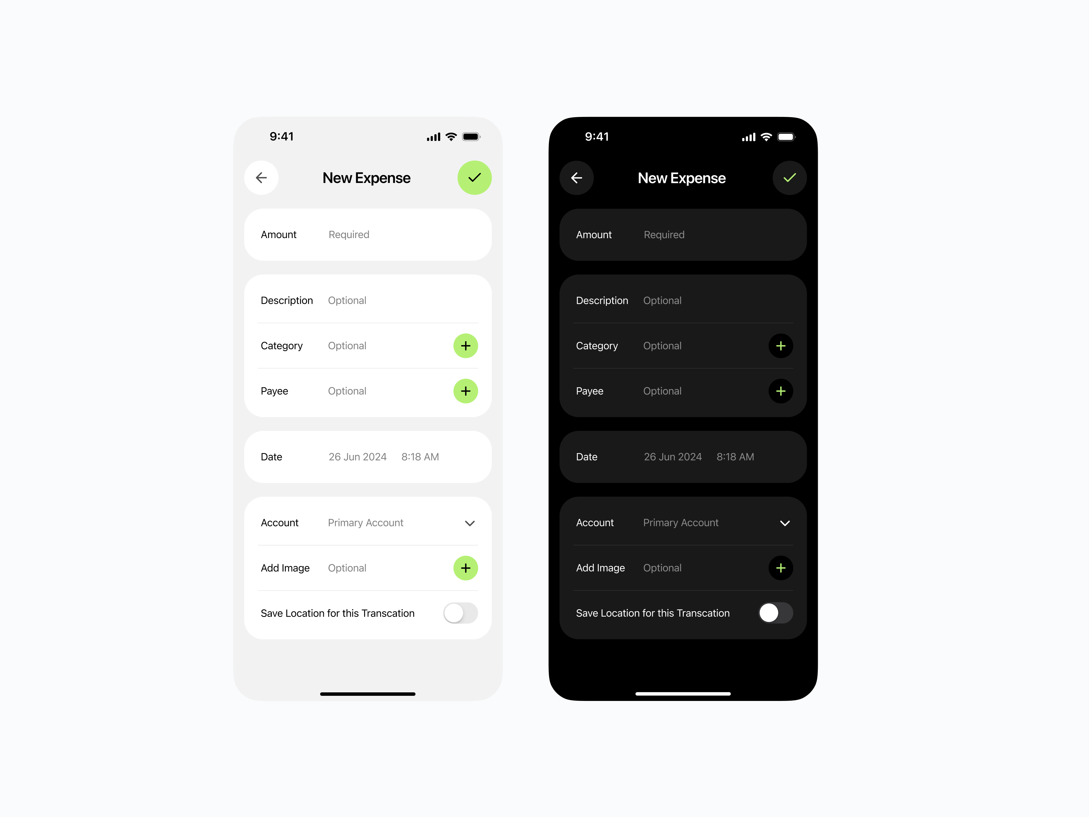
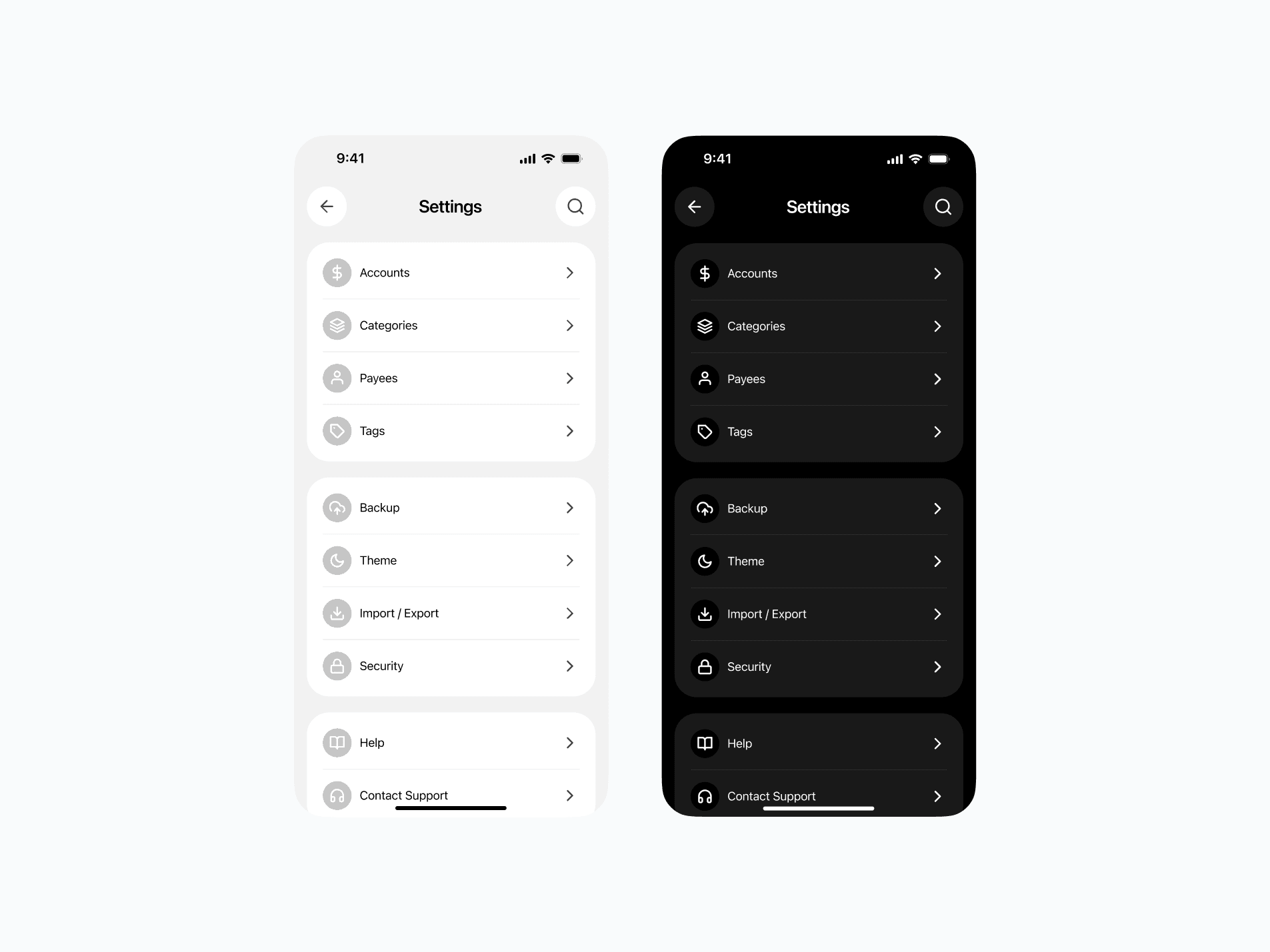
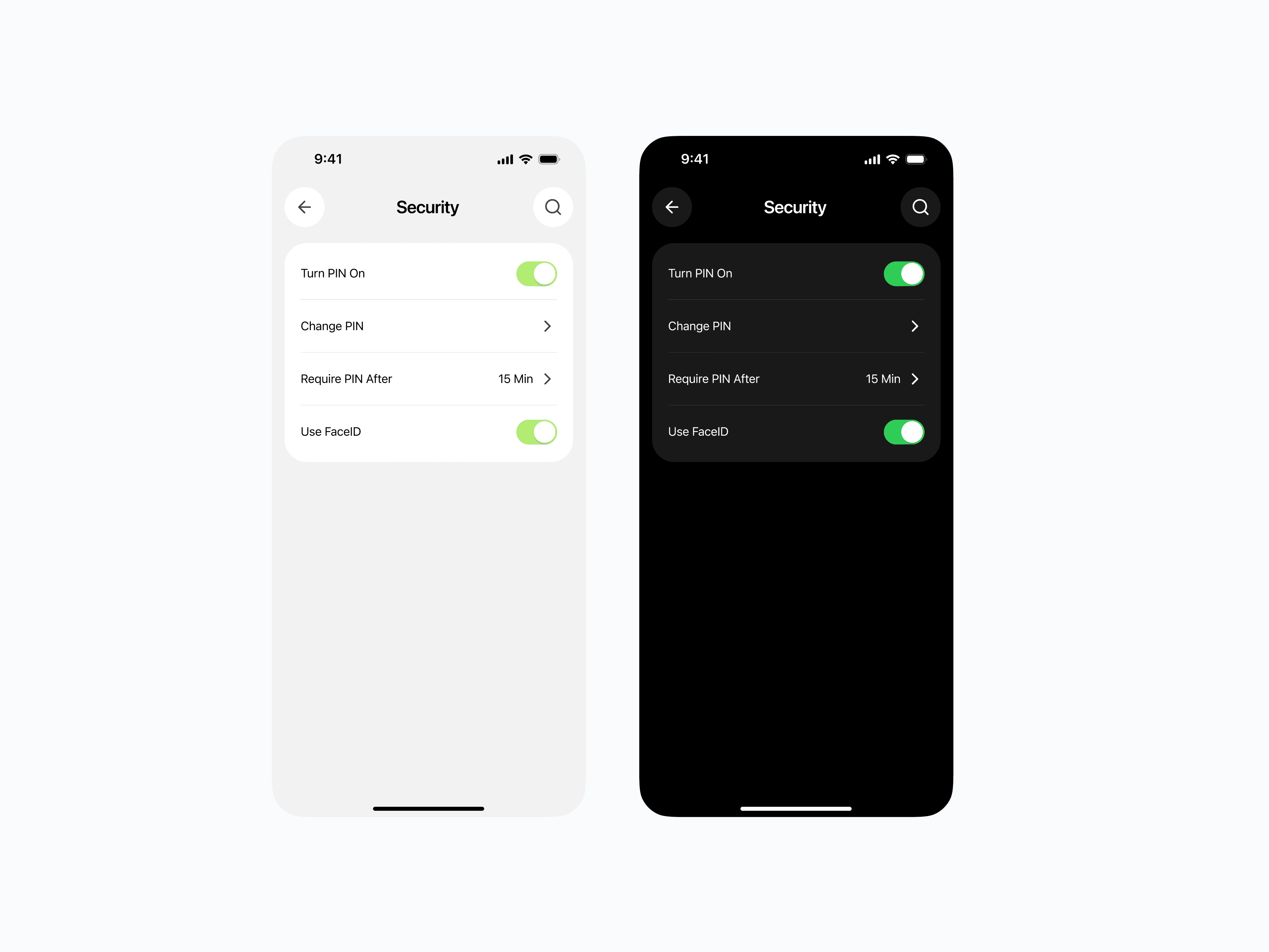
The key was hiding complexity behind a clean surface — power users can find advanced features when they need them, but they never get in the way for casual users.
The UX Philosophy
PocketBook is built around the idea that simplicity drives consistency.
If logging an expense takes 5 seconds and feels effortless, users will keep doing it — and that’s how financial awareness is built.
Visual Language
Typography: Bold for key figures, light for secondary details — creating instant visual hierarchy.
Spacing: Generous padding keeps the interface breathable.
Icons: Simple, recognizable, and consistent in style.
The Outcome
A clean, approachable finance app that looks as good as it works.
All essential features without the typical financial-app overload.
An interface so simple that even non-tech users can adopt it instantly.

