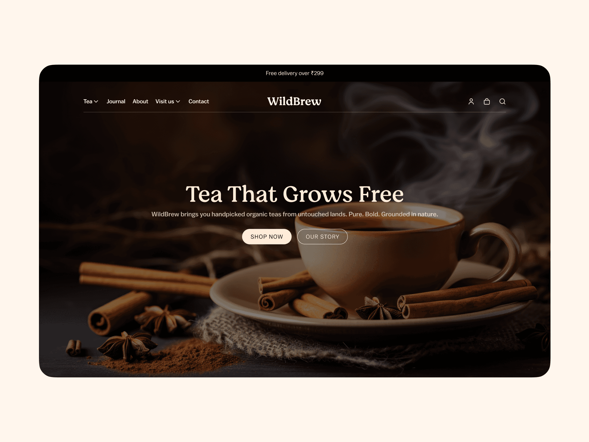
A Sip of the Challenge
WildBrew isn’t just selling tea — they’re selling an experience. The kind that smells earthy, feels warm in your hands, and carries stories from faraway hills.
Our task? Create a landing page that makes visitors feel that before they ever take a sip — and then guide them gently toward purchase.
Designing the First Pour — The Hero Section
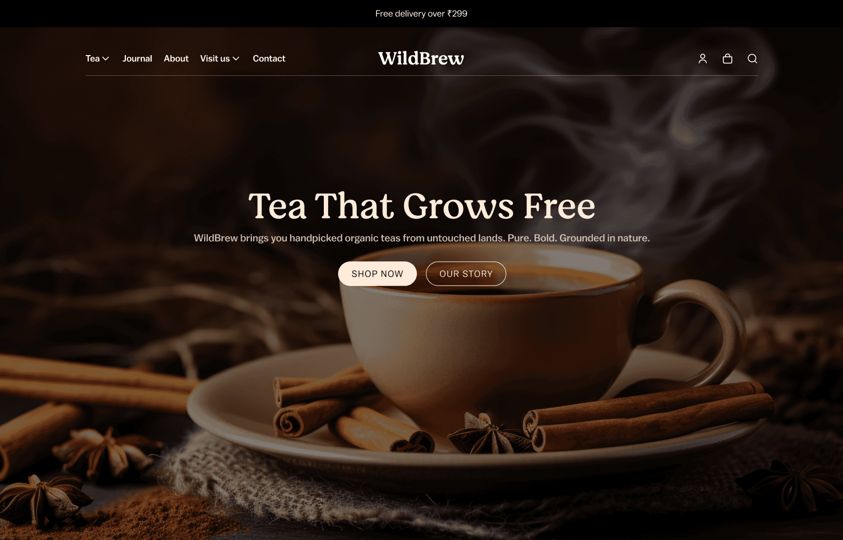
The hero section became our first impression.
Why warm tones & steam? Because nothing says “tea” like seeing it alive in the cup. It’s sensory marketing through visuals.
Two CTAs:
Shop Now — for the decisive ones.
Our Story — for the curious ones.
This way, no matter the visitor’s intent, there’s a clear path.
Serving the Favorites
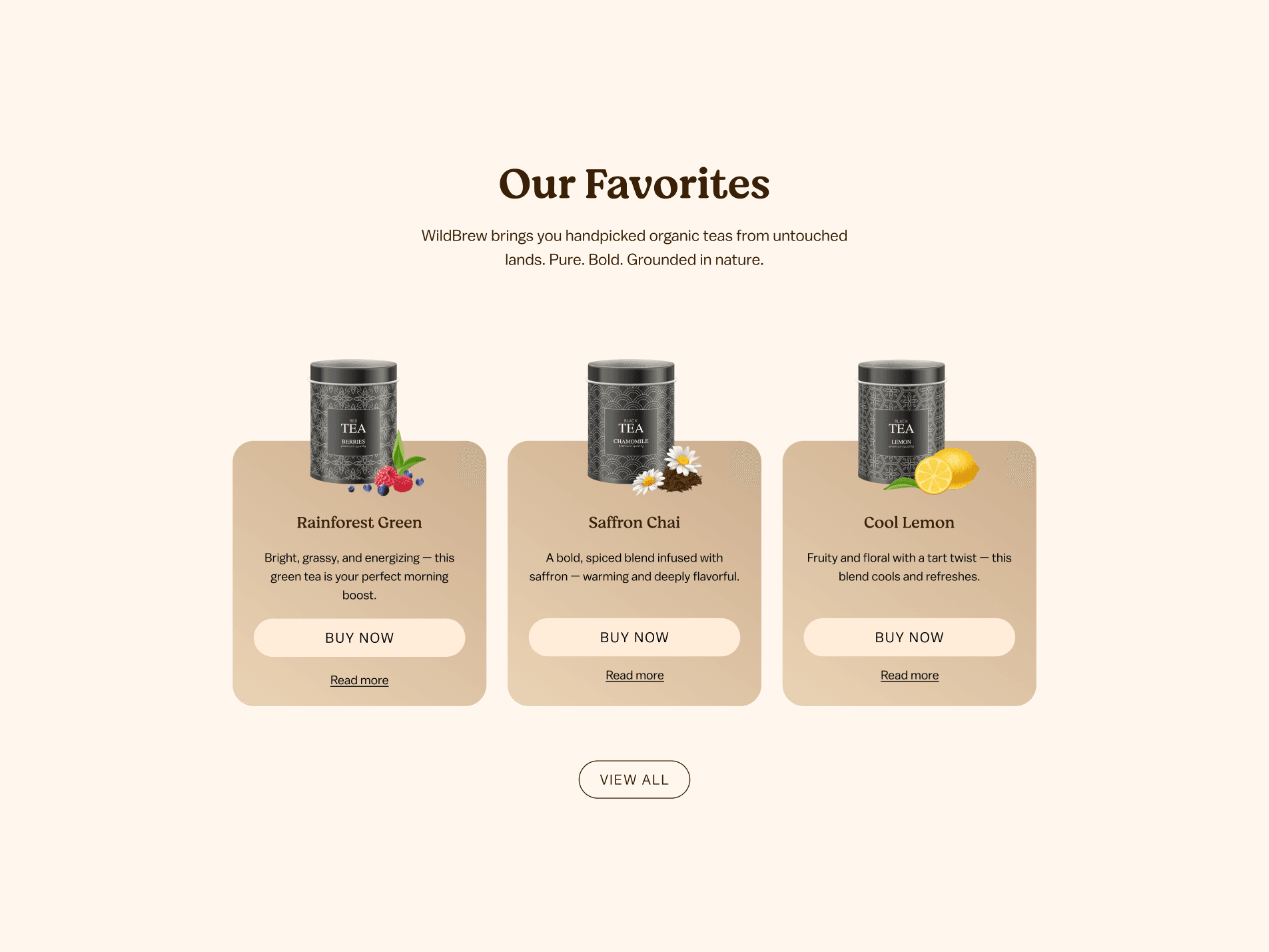
The “Our Favorites” section puts three bestsellers front and center.
Why three? Easy on the eyes, keeps the focus sharp.
Each product gets a buy now button for instant action and a read more for the explorers.
The design breathes — space around the products makes them feel premium.
A Taste of the Season
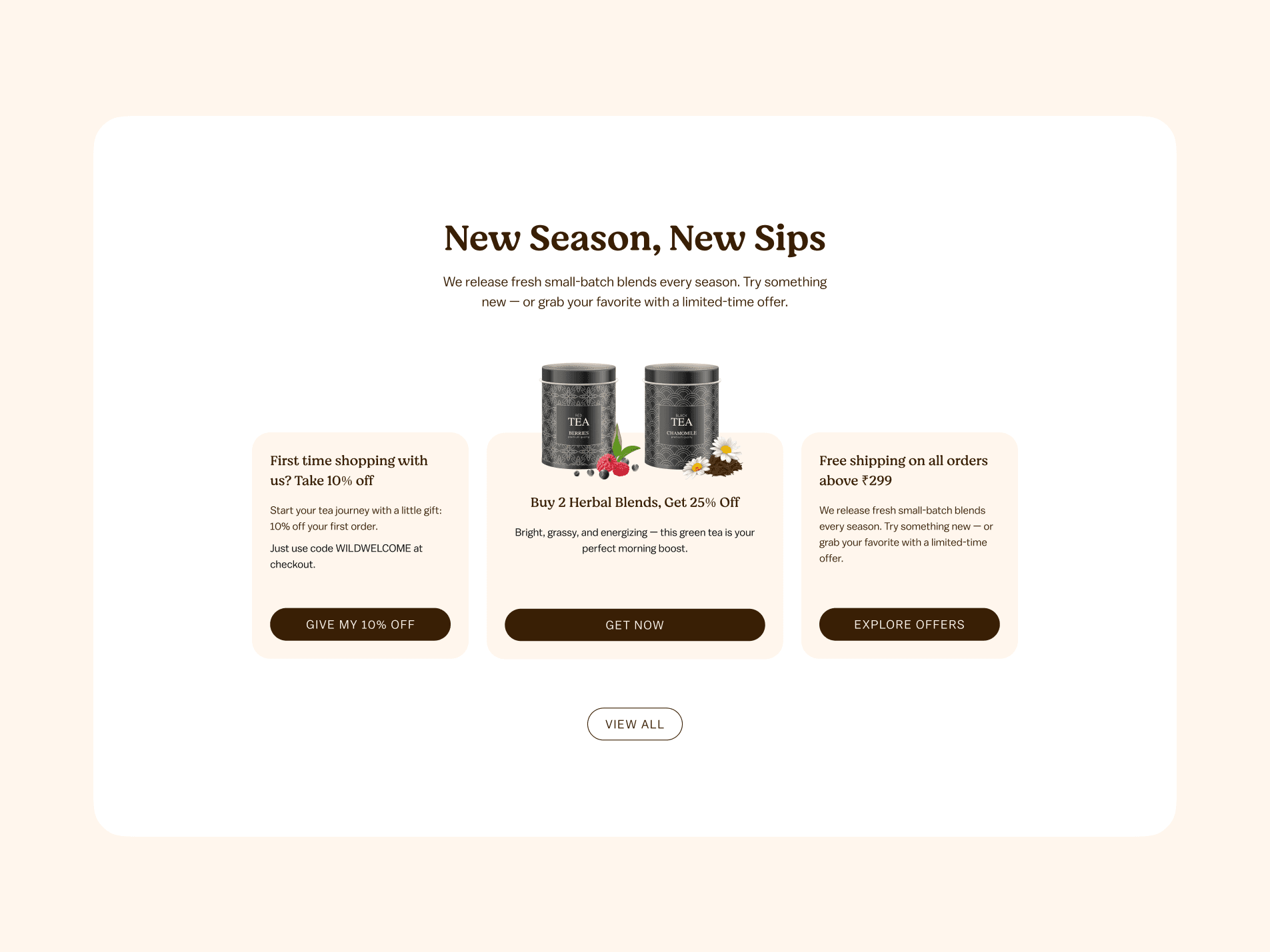
Instead of flooding visitors with discounts everywhere, we created a neatly packaged offers row:
First-time shopper welcome
Bundle deal
Free shipping threshold
All in clean cards with big headlines and no clutter. The offers feel like an invitation, not a shout.
Roots That Matter
The “Our Roots Run Deep” section is where the brand becomes personal:
A scrollable gallery shows tea farms, farmers, and nature.
A warm mission statement makes the tea feel like part of a bigger story — sustainability, fair trade, and care.
This is where brand trust is brewed.
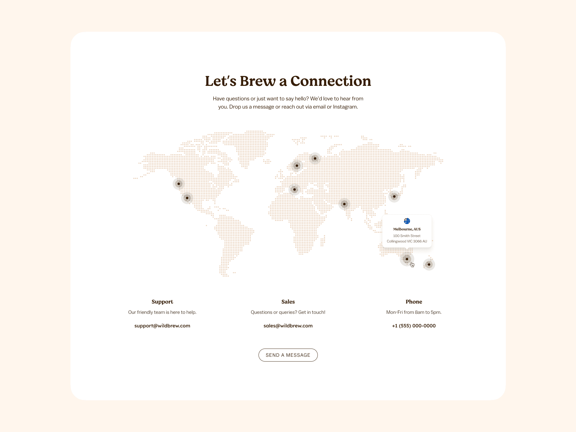
Connecting Beyond the Cup
Instead of a plain “Contact Us,” we used:
A world map to show reach and connection.
Multiple ways to reach out (support, sales, phone) to remove hesitation.
The Flavor Profile — Visual & UX Choices
Colors: Soft beiges & browns = nature + calm.
Typography: Elegant serif headlines to feel artisanal; clean sans-serif for easy reading.
Spacing: Plenty of white space so nothing feels rushed — like tea time.
The Result
We ended up with a page that doesn’t just list products — it tells a brand story, offers multiple entry points for conversion, and keeps visitors immersed from first glance to final click.
For WildBrew, it’s not just a landing page. It’s an online tea ceremony.
